Hierarchy for a deep structure
Parts, chapters, POV names, dates, locations, and epigraphs need distinct but related styles. Readers should understand the level immediately without a decorative overload.
Fantasy interiors often carry more structure than ordinary fiction: maps, named parts, epigraphs, multiple locations, appendices, glossaries, and long series. The template has to create atmosphere without turning worldbuilding into visual clutter.

Every interior decision works together: type, measure, rhythm, hierarchy, and the white space around the text.
The template should remain quiet through ordinary pages and become expressive only where the manuscript needs a transition.
9Use a readable serif at a trim that can support the manuscript length—often 5.5 × 8.5 or 6 × 9 for epic fantasy. Establish hierarchy for part titles, chapter titles, epigraphs, maps, and appendices. Keep ornaments simple enough to reproduce in small print and EPUB.
Genre signals matter, but consistency and readability are what make the interior feel professionally produced across hundreds of pages.
Parts, chapters, POV names, dates, locations, and epigraphs need distinct but related styles. Readers should understand the level immediately without a decorative overload.
Maps need sufficient resolution, legible labels, and a size appropriate to the trim. Test grayscale reproduction and do not assume the ebook reader will view a two-page spread.
Small changes to type, leading, and trim can move an epic manuscript by dozens of pages. Balance readability against spine, print cost, shipping weight, and series consistency.
Glossaries, dramatis personae, timelines, pronunciation notes, and lore appendices need a planned hierarchy and navigation rather than improvised body-text lists.
Trim establishes the physical page. Gutter, outside, top, and bottom margins define the live area and need to account for binding, page count, genre convention, and reading comfort.
Typeface, size, line length, leading, indentation, paragraph spacing, hyphenation, and widow/orphan behavior create the texture readers experience for most of the book.
Part, chapter, heading, extract, caption, list, and special-content styles tell readers what kind of information they are seeing and how it relates to the whole.
Headers and folios help navigation but need suppression rules for opening pages, front matter, blank pages, and any page where they compete with the content.
Chapter openings, section openers, scene breaks, and page turns control rhythm. They need visual clarity and fallback behavior when reflow places a transition near a boundary.
Print resolves exact pages. EPUB preserves semantic reading order and adapts to the device. One source should produce both without forcing fixed-page assumptions into reflowable text.
Fantasy invites elaborate type and ornament, but the reader spends most of the book in body text. A dramatic chapter opener can establish tone; a decorative body face or dense border repeated for 500 pages becomes fatigue. The template should feel genre-aware at transitions and invisible during reading.
Use a small visual vocabulary and repeat it. A part opener may carry the strongest display treatment, chapter openings a quieter version, and scene breaks the smallest motif. Cambric’s rule-based approach keeps those levels related.
Epic fantasy word counts magnify every layout choice. A narrower trim, larger body, wider leading, or generous chapter starts can create a very thick and expensive book. That page count then changes cover spine and may affect which print configurations are practical.
Test representative chapters and the full manuscript at plausible settings. Do not compress purely to save cost: cramped type and tight gutters harm the reading experience. The best solution may be a larger trim, a carefully chosen typeface, or splitting a genuinely oversized volume.
An EPUB reader can enlarge an image, but a complex map may still be difficult on a phone. Use high-quality images, meaningful captions or surrounding text, and avoid relying on a spread. Glossaries and appendices need clear heading structure so navigation remains useful.
Print and ebook should share content order and identity, not fixed layout. Generate both from one manuscript so names, maps, and lore updates do not drift between editions.
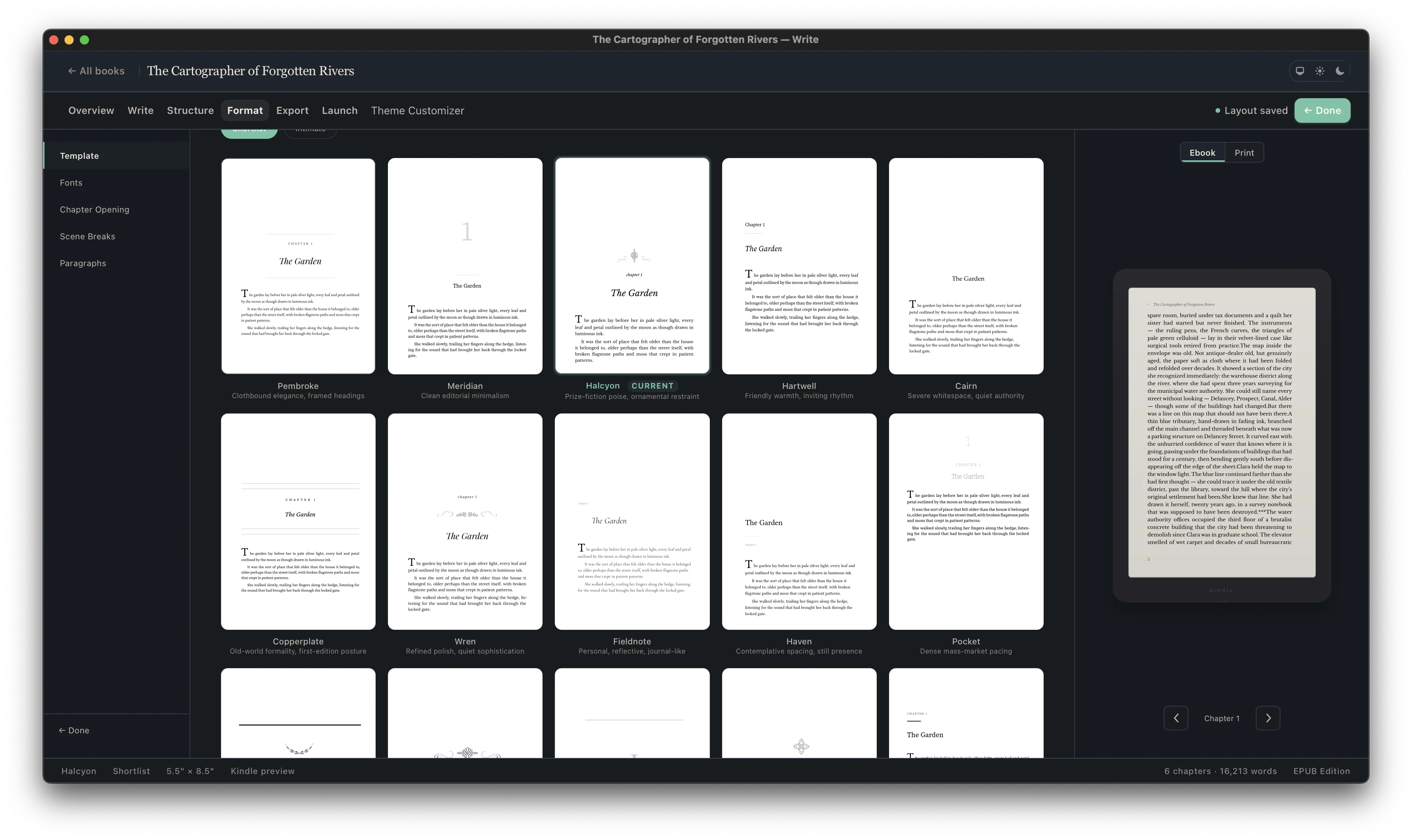
A template is useful only if it survives your content. Import or write the manuscript, choose an interior direction, set the edition, and inspect chapter titles, long pages, short pages, special extracts, images, front matter, and back matter in context.
Not every book needs every part. Decide intentionally, order the parts consistently, and test both the print and ebook navigation.
Define its place and hierarchy before final page composition.
Define its place and hierarchy before final page composition.
Define its place and hierarchy before final page composition.
Define its place and hierarchy before final page composition.
Keep the reader journey and future catalog updates in view.
Keep the reader journey and future catalog updates in view.
Keep the reader journey and future catalog updates in view.
Keep the reader journey and future catalog updates in view.
| Template element | Print edition | EPUB edition |
|---|---|---|
| Body typography | Exact type, size, line length, leading, and page composition | Styled defaults that yield to reader font and display choices |
| Chapter openings | Controlled page start and vertical position | Clear hierarchy without assuming a fixed physical page |
| Running heads and folios | Useful navigation with suppression rules | Omitted; the reading system provides location and navigation |
| Scene or section breaks | Spacing or ornament with page-boundary fallback | Semantic divider that remains visible as text reflows |
| Contents | Page-numbered list where the genre needs it | Linked navigation generated from structured headings |
| Images and extracts | Composed at exact size within the live area | Responsive treatment that survives narrow screens and enlarged type |
5.5 × 8.5 and 6 × 9 are common because they can manage long word counts, but genre positioning, page count, and desired physical format should determine the choice.
Use high-resolution artwork with labels readable at final size. Test grayscale print, keep important content away from the gutter, and provide an ebook treatment that does not require a two-page spread.
Yes. Treat it as a structured back-matter section with consistent entry styling and useful ebook navigation.
Usually no. Decorative or historic faces work better for display elements. Body text should remain highly readable across hundreds of pages.
Cambric is intended for long-form, series, and backlist workflows, with repeatable interiors and unlimited books under one license.