Quiet body typography
Fiction is read continuously. Body type should have familiar letterforms, moderate contrast, comfortable leading, and a line length that keeps dialogue and long paragraphs moving.
The best novel template does not advertise the template. It establishes readable type, quiet chapter rhythm, unmistakable scene breaks, and consistent running matter so the reader stays inside the narrative.

Every interior decision works together: type, measure, rhythm, hierarchy, and the white space around the text.
The template should remain quiet through ordinary pages and become expressive only where the manuscript needs a transition.
9Use a restrained serif body, a clear but not oversized chapter treatment, first-paragraph logic that remains consistent, and a scene-break system that still communicates a break when it falls near a page boundary. Start from 5 × 8, 5.25 × 8, or 5.5 × 8.5 depending on genre length and target page count.
Genre signals matter, but consistency and readability are what make the interior feel professionally produced across hundreds of pages.
Fiction is read continuously. Body type should have familiar letterforms, moderate contrast, comfortable leading, and a line length that keeps dialogue and long paragraphs moving.
Begin chapters on a fresh page with a consistent vertical position. Suppress running heads and usually the visible folio on the opening page so the transition feels intentional.
Use an ornament or a measured blank line, but provide a page-boundary treatment. A break cannot vanish merely because it lands at the top or bottom of a page.
Most novels need fewer styles than authors expect. Chapter number, chapter title, body, extract or letter, and a small set of front/back-matter styles are usually enough.
Trim establishes the physical page. Gutter, outside, top, and bottom margins define the live area and need to account for binding, page count, genre convention, and reading comfort.
Typeface, size, line length, leading, indentation, paragraph spacing, hyphenation, and widow/orphan behavior create the texture readers experience for most of the book.
Part, chapter, heading, extract, caption, list, and special-content styles tell readers what kind of information they are seeing and how it relates to the whole.
Headers and folios help navigation but need suppression rules for opening pages, front matter, blank pages, and any page where they compete with the content.
Chapter openings, section openers, scene breaks, and page turns control rhythm. They need visual clarity and fallback behavior when reflow places a transition near a boundary.
Print resolves exact pages. EPUB preserves semantic reading order and adapts to the device. One source should produce both without forcing fixed-page assumptions into reflowable text.
A fiction page has few visible elements, so every inconsistency becomes more noticeable. Uneven indents, crowded lines, a misplaced running head, or an ambiguous scene break interrupts the reading rhythm. Professionalism comes from hundreds of quiet pages obeying the same system.
A rule-based template is especially valuable because corrections reflow the manuscript. Instead of hand-tuning each page, the author establishes a hierarchy and inspects exceptions. Cambric composes the pages live so those exceptions become visible before export.
Trim is not packaging applied after typography. A narrower page changes line length, dialogue rhythm, page count, gutter pressure, and printing cost. Test the actual manuscript at two plausible trims rather than choosing from convention alone.
The body type should be judged on a complete spread and eventually on paper. A font that looks elegant at a large screen zoom may feel pale, small, or cramped in a printed proof. Keep decoration away from the reading text and put visual identity into chapter openings and small recurring details.
The print template can control pages, running heads, and exact vertical space. The EPUB cannot: readers change font, size, and screen. Preserve identity through hierarchy, chapter treatment, scene-break symbols, and content order while allowing the ebook to reflow.
Both editions should come from the same structured source. That protects chapter order, italics, scene breaks, and back matter even though the layout systems differ.
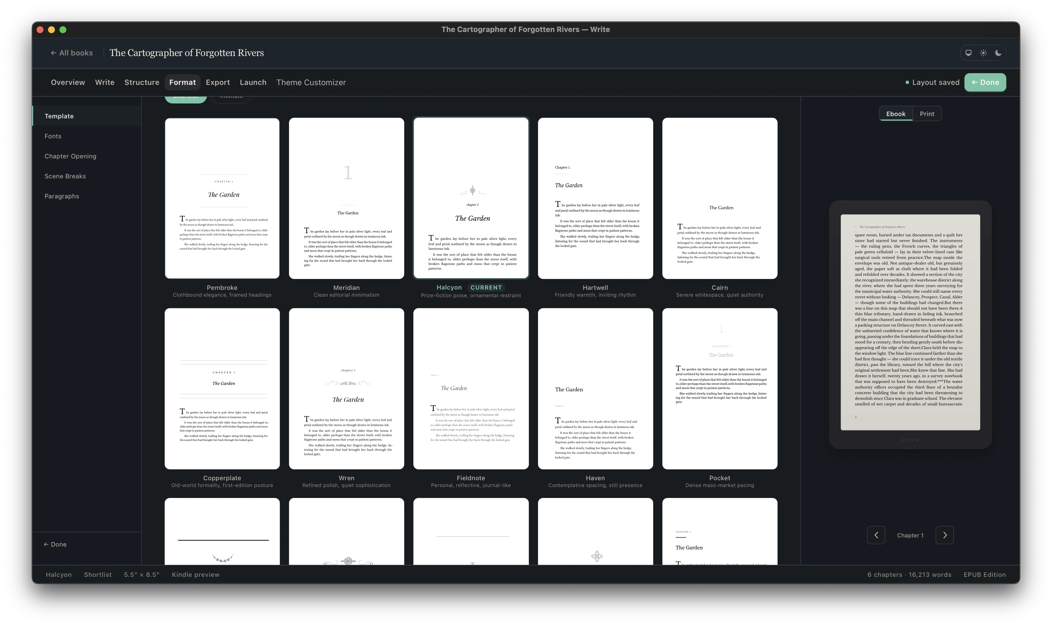
A template is useful only if it survives your content. Import or write the manuscript, choose an interior direction, set the edition, and inspect chapter titles, long pages, short pages, special extracts, images, front matter, and back matter in context.
Not every book needs every part. Decide intentionally, order the parts consistently, and test both the print and ebook navigation.
Define its place and hierarchy before final page composition.
Define its place and hierarchy before final page composition.
Define its place and hierarchy before final page composition.
Define its place and hierarchy before final page composition.
Keep the reader journey and future catalog updates in view.
Keep the reader journey and future catalog updates in view.
Keep the reader journey and future catalog updates in view.
Keep the reader journey and future catalog updates in view.
| Template element | Print edition | EPUB edition |
|---|---|---|
| Body typography | Exact type, size, line length, leading, and page composition | Styled defaults that yield to reader font and display choices |
| Chapter openings | Controlled page start and vertical position | Clear hierarchy without assuming a fixed physical page |
| Running heads and folios | Useful navigation with suppression rules | Omitted; the reading system provides location and navigation |
| Scene or section breaks | Spacing or ornament with page-boundary fallback | Semantic divider that remains visible as text reflows |
| Contents | Page-numbered list where the genre needs it | Linked navigation generated from structured headings |
| Images and extracts | Composed at exact size within the live area | Responsive treatment that survives narrow screens and enlarged type |
5 × 8, 5.25 × 8, and 5.5 × 8.5 are common trade-fiction choices. The best choice depends on genre expectation, word count, target page count, print cost, and desired physical feel.
Traditional fiction often omits the indent after a chapter heading or scene break, then indents later paragraphs. The rule matters less than applying it consistently.
They are common in print but optional. If used, they should be suppressed on chapter openings and intentionally blank pages.
No. This is a production blueprint. Cambric applies professional interior systems in a book-aware desktop workflow rather than giving you a fragile Word file to maintain manually.
The same hierarchy and identity can carry into EPUB, but fixed page features do not. Cambric creates format-appropriate print and ebook outputs from the same manuscript.