Voice-first typography
The interior should feel considered without becoming sentimental or ornate. Body text carries the author’s voice and needs generous, calm readability.
Memoir combines the continuous reading needs of fiction with the supporting material of nonfiction: photographs, dates, documents, section breaks, captions, notes, and sometimes multiple timelines. The template should preserve voice while making context easy to follow.
Every interior decision works together: type, measure, rhythm, hierarchy, and the white space around the text.
The template should remain quiet through ordinary pages and become expressive only where the manuscript needs a transition.
9Use 5.5 × 8.5 or 6 × 9, a literary but highly readable serif, clear part and chapter hierarchy, and a restrained system for photographs, captions, dates, and extracts. Keep family documents and letters as text when possible rather than flattening them into images.
Genre signals matter, but consistency and readability are what make the interior feel professionally produced across hundreds of pages.
The interior should feel considered without becoming sentimental or ornate. Body text carries the author’s voice and needs generous, calm readability.
Images need adequate resolution, consistent placement, captions, credits where required, and a plan for grayscale print and small-screen ebook display.
Dates, ages, places, and shifts between present reflection and past narrative need a stable hierarchy when the prose alone is not enough.
Letters, documents, lyrics, photographs, and quotations may involve permissions, privacy, and attribution. Formatting cannot solve rights questions, but it should preserve clear sourcing.
Trim establishes the physical page. Gutter, outside, top, and bottom margins define the live area and need to account for binding, page count, genre convention, and reading comfort.
Typeface, size, line length, leading, indentation, paragraph spacing, hyphenation, and widow/orphan behavior create the texture readers experience for most of the book.
Part, chapter, heading, extract, caption, list, and special-content styles tell readers what kind of information they are seeing and how it relates to the whole.
Headers and folios help navigation but need suppression rules for opening pages, front matter, blank pages, and any page where they compete with the content.
Chapter openings, section openers, scene breaks, and page turns control rhythm. They need visual clarity and fallback behavior when reflow places a transition near a boundary.
Print resolves exact pages. EPUB preserves semantic reading order and adapts to the device. One source should produce both without forcing fixed-page assumptions into reflowable text.
The core memoir should read with the continuity of a novel. Supporting photos, letters, timelines, and notes add evidence and texture, but too many competing styles can fragment the voice. Establish a body system first, then give each recurring documentary type one consistent treatment.
Cambric lets the author inspect how these elements affect actual pages. A photograph that seems modest in a document may strand a caption or create an awkward blank in the chosen trim. Live composition makes the trade visible.
Collect the highest-resolution originals, decide whether print will be grayscale or color, write captions, and record rights and credits before layout. Keep important faces and details away from the gutter. If images form a plate section, treat that as an intentional book part rather than scattering files randomly.
In EPUB, images scale to different screens and may separate from surrounding text. Captions and reading order should remain meaningful. Do not make critical narrative text part of an image unless a fixed-layout edition truly requires it.
A memoir may move among childhood, a central event, and present-day reflection. Section or chapter labels can orient the reader, but constant timestamps can make a literary narrative feel like a case file. Use metadata only where the recurring structure needs it.
A template provides part, chapter, epigraph, and extract levels. The author decides which timeline transitions deserve a visible signal and applies the choice consistently in print and ebook.
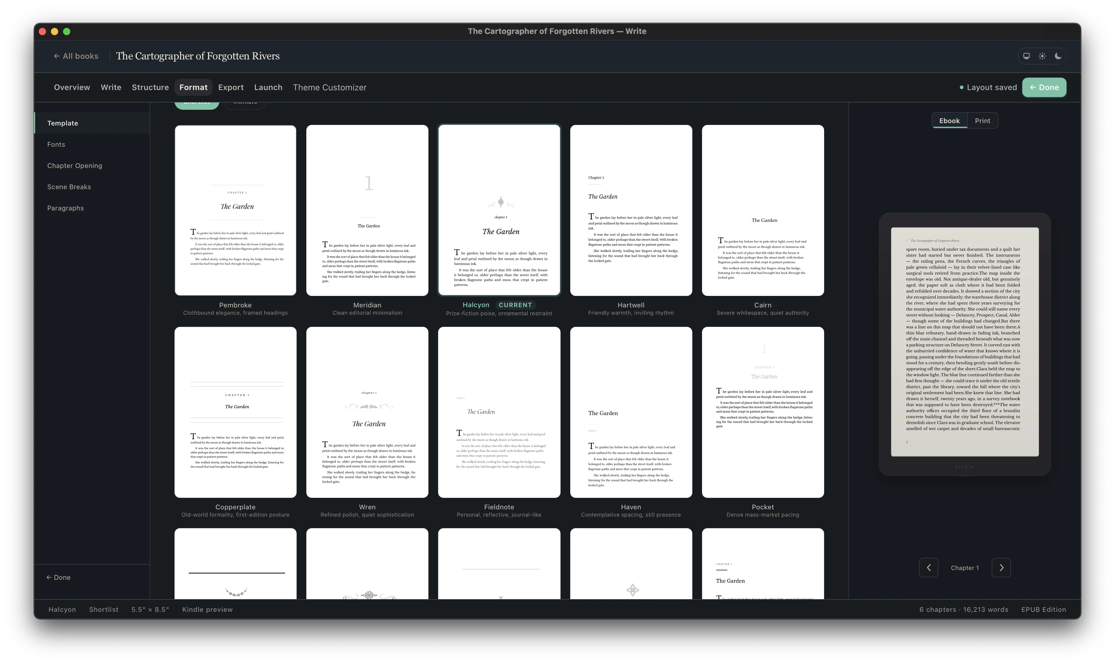
A template is useful only if it survives your content. Import or write the manuscript, choose an interior direction, set the edition, and inspect chapter titles, long pages, short pages, special extracts, images, front matter, and back matter in context.
Not every book needs every part. Decide intentionally, order the parts consistently, and test both the print and ebook navigation.
Define its place and hierarchy before final page composition.
Define its place and hierarchy before final page composition.
Define its place and hierarchy before final page composition.
Define its place and hierarchy before final page composition.
Keep the reader journey and future catalog updates in view.
Keep the reader journey and future catalog updates in view.
Keep the reader journey and future catalog updates in view.
Keep the reader journey and future catalog updates in view.
| Template element | Print edition | EPUB edition |
|---|---|---|
| Body typography | Exact type, size, line length, leading, and page composition | Styled defaults that yield to reader font and display choices |
| Chapter openings | Controlled page start and vertical position | Clear hierarchy without assuming a fixed physical page |
| Running heads and folios | Useful navigation with suppression rules | Omitted; the reading system provides location and navigation |
| Scene or section breaks | Spacing or ornament with page-boundary fallback | Semantic divider that remains visible as text reflows |
| Contents | Page-numbered list where the genre needs it | Linked navigation generated from structured headings |
| Images and extracts | Composed at exact size within the live area | Responsive treatment that survives narrow screens and enlarged type |
5.5 × 8.5 and 6 × 9 are common. A photo-heavy memoir may benefit from a larger trim, while a literary memoir may use a compact trade-fiction size.
There is no universal number. Include images that add narrative or documentary value, then test how their resolution, placement, and printing cost affect the edition.
That is a cost and editorial decision. Grayscale is usually less expensive; color may be essential to the material. Prepare images for the actual print option.
Use script sparingly. Long letters are usually more readable in a differentiated serif or sans-serif extract style, especially in EPUB.
Yes. Cambric supports text-led books with images and exports print PDF plus EPUB from the same source.