Pace-friendly pages
Keep body type open enough for rapid dialogue and short paragraphs without inflating the page count unnecessarily. Avoid elaborate display choices that slow the reader at every chapter.
Romance readers move quickly and often continue through a series. The interior should support dialogue-heavy pages, clear point-of-view transitions, emotionally paced chapter openings, and back matter that turns a satisfied reader toward the next title.

Every interior decision works together: type, measure, rhythm, hierarchy, and the white space around the text.
The template should remain quiet through ordinary pages and become expressive only where the manuscript needs a transition.
9Start with 5 × 8 or 5.5 × 8.5, a warm readable serif, compact but distinct chapter openings, and a restrained scene ornament. If the novel alternates points of view, make the POV label part of the chapter system rather than an ad hoc heading.
Genre signals matter, but consistency and readability are what make the interior feel professionally produced across hundreds of pages.
Keep body type open enough for rapid dialogue and short paragraphs without inflating the page count unnecessarily. Avoid elaborate display choices that slow the reader at every chapter.
Dual- or multi-POV books need consistent labels and navigation. The name, chapter number, date, or location hierarchy should never make readers decode who is speaking.
A small ornament can support the emotional and market identity of the book, but it must remain legible in print and ebook and should never overpower the prose.
Series order, next-book teaser, newsletter invitation, review request, and also-by list are part of the reader journey. Treat them as designed book parts, not last-minute pasted pages.
Trim establishes the physical page. Gutter, outside, top, and bottom margins define the live area and need to account for binding, page count, genre convention, and reading comfort.
Typeface, size, line length, leading, indentation, paragraph spacing, hyphenation, and widow/orphan behavior create the texture readers experience for most of the book.
Part, chapter, heading, extract, caption, list, and special-content styles tell readers what kind of information they are seeing and how it relates to the whole.
Headers and folios help navigation but need suppression rules for opening pages, front matter, blank pages, and any page where they compete with the content.
Chapter openings, section openers, scene breaks, and page turns control rhythm. They need visual clarity and fallback behavior when reflow places a transition near a boundary.
Print resolves exact pages. EPUB preserves semantic reading order and adapts to the device. One source should produce both without forcing fixed-page assumptions into reflowable text.
Romance has strong digital readership, rapid series consumption, and many dialogue-heavy scenes. That makes both EPUB resilience and print readability essential. The interior needs enough identity to feel intentional while staying fast and familiar.
The chapter system should handle short chapters, dual POV, dates or locations, text messages, and epigraphs without creating a new visual language for every device. Cambric keeps these structures tied to the source and composes the print pages live.
Back matter is not an appendix to the commercial strategy. A reader who reaches the happy ending is at the highest-intent moment for the next book. Place the next step clearly, keep retailer links appropriate to the edition, and update older volumes as the catalog grows.
A maintained template makes those updates easier. The series should share trim, typography, scene language, and recurring pages, while each volume can still have a distinct cover and chapter flavor.
Letters, messages, journal excerpts, lyrics, or memory fragments can help storytelling but often become formatting traps. Define a small number of extract styles and use them consistently. Over-styling a whole scene can reduce readability, especially in EPUB.
Test special content on a narrow screen and in the print trim. The treatment should survive reflow, remain accessible, and signal a change in voice without making the reader work.
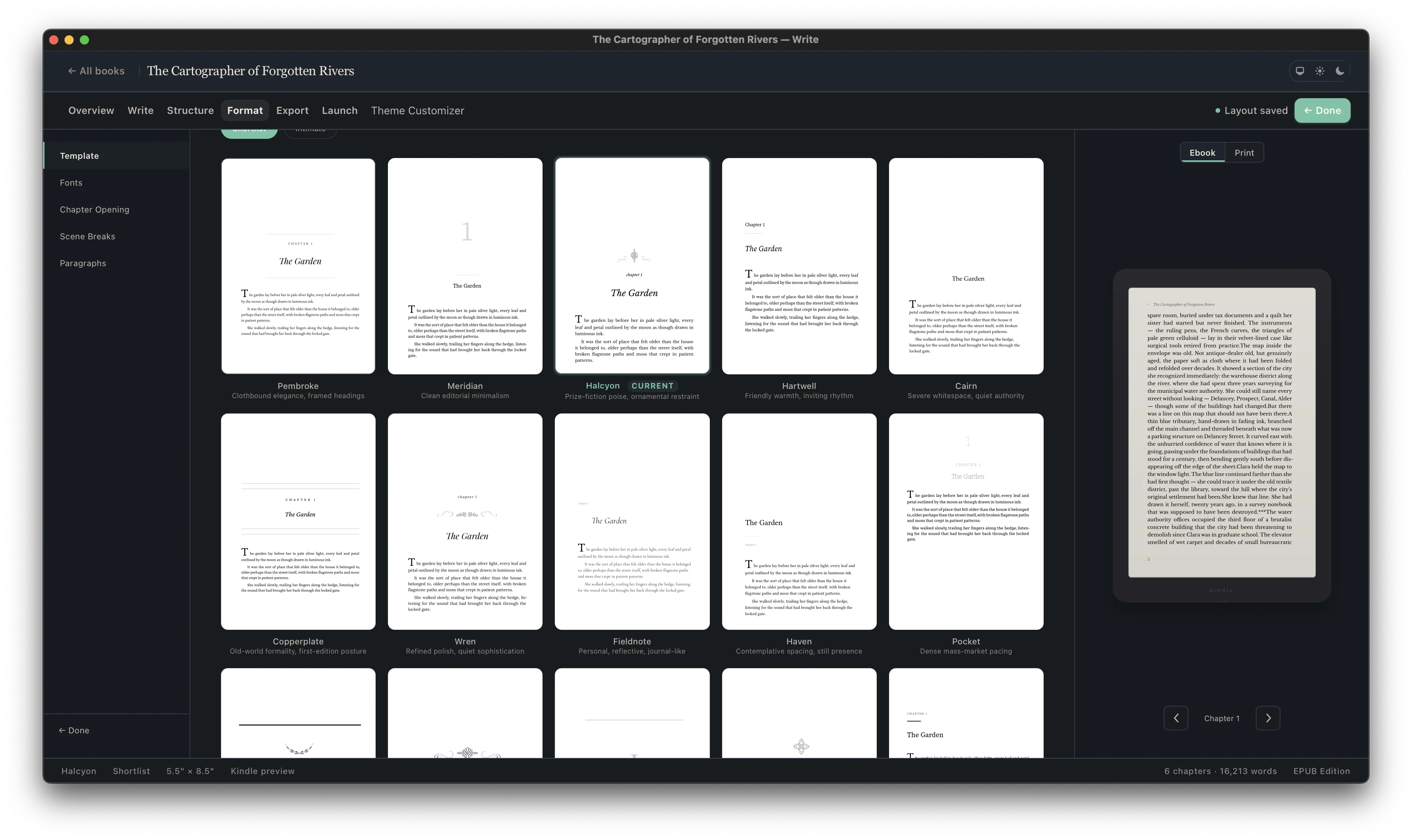
A template is useful only if it survives your content. Import or write the manuscript, choose an interior direction, set the edition, and inspect chapter titles, long pages, short pages, special extracts, images, front matter, and back matter in context.
Not every book needs every part. Decide intentionally, order the parts consistently, and test both the print and ebook navigation.
Define its place and hierarchy before final page composition.
Define its place and hierarchy before final page composition.
Define its place and hierarchy before final page composition.
Define its place and hierarchy before final page composition.
Keep the reader journey and future catalog updates in view.
Keep the reader journey and future catalog updates in view.
Keep the reader journey and future catalog updates in view.
Keep the reader journey and future catalog updates in view.
| Template element | Print edition | EPUB edition |
|---|---|---|
| Body typography | Exact type, size, line length, leading, and page composition | Styled defaults that yield to reader font and display choices |
| Chapter openings | Controlled page start and vertical position | Clear hierarchy without assuming a fixed physical page |
| Running heads and folios | Useful navigation with suppression rules | Omitted; the reading system provides location and navigation |
| Scene or section breaks | Spacing or ornament with page-boundary fallback | Semantic divider that remains visible as text reflows |
| Contents | Page-numbered list where the genre needs it | Linked navigation generated from structured headings |
| Images and extracts | Composed at exact size within the live area | Responsive treatment that survives narrow screens and enlarged type |
5 × 8 and 5.5 × 8.5 are common. Choose after testing page count, print cost, subgenre expectations, and the physical density of the manuscript.
Use one consistent system—often the character name with or without chapter numbering—and make it visible in both print and ebook navigation.
Decoration belongs in restrained display elements, not body text. Readability and genre tone matter more than a script font that becomes tiring or fails in ebook rendering.
Common elements include acknowledgments, also-by and series order, review request, newsletter invitation, and a teaser for the next book.
Yes. Cambric is designed for repeatable book settings and professional interiors across unlimited books.